Beam / New Product Development
MISSION:
RocketFuel Brands, in partnership with experts in the beauty category, are bringing a haircare brand to market that brings trusted skincare technology to accessible and affordable hair products.
work:
Contributed to naming, category and competitor research, and brand positioning. Designed concepts for branding and packaging to pitch to our internal partners.
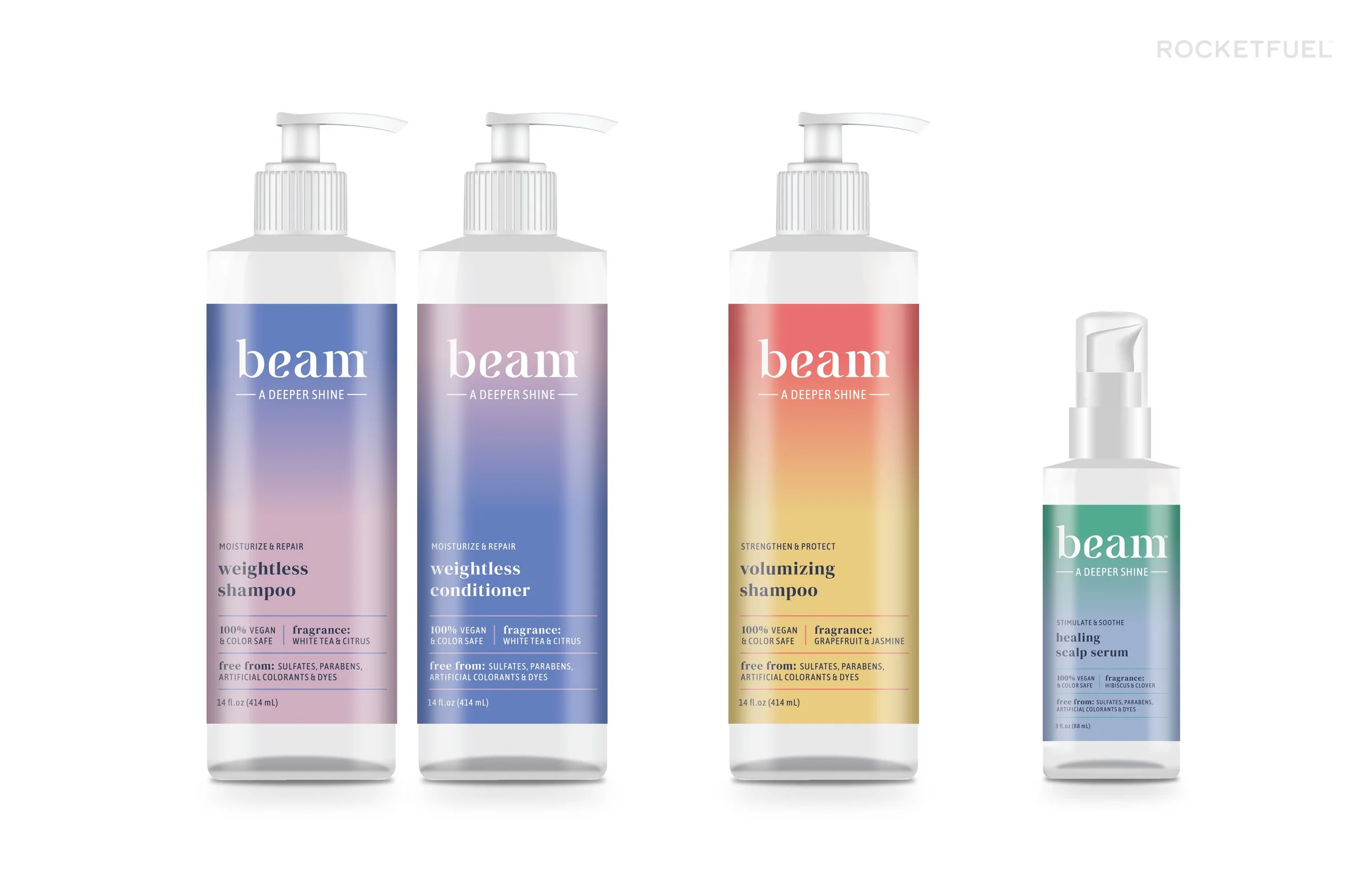
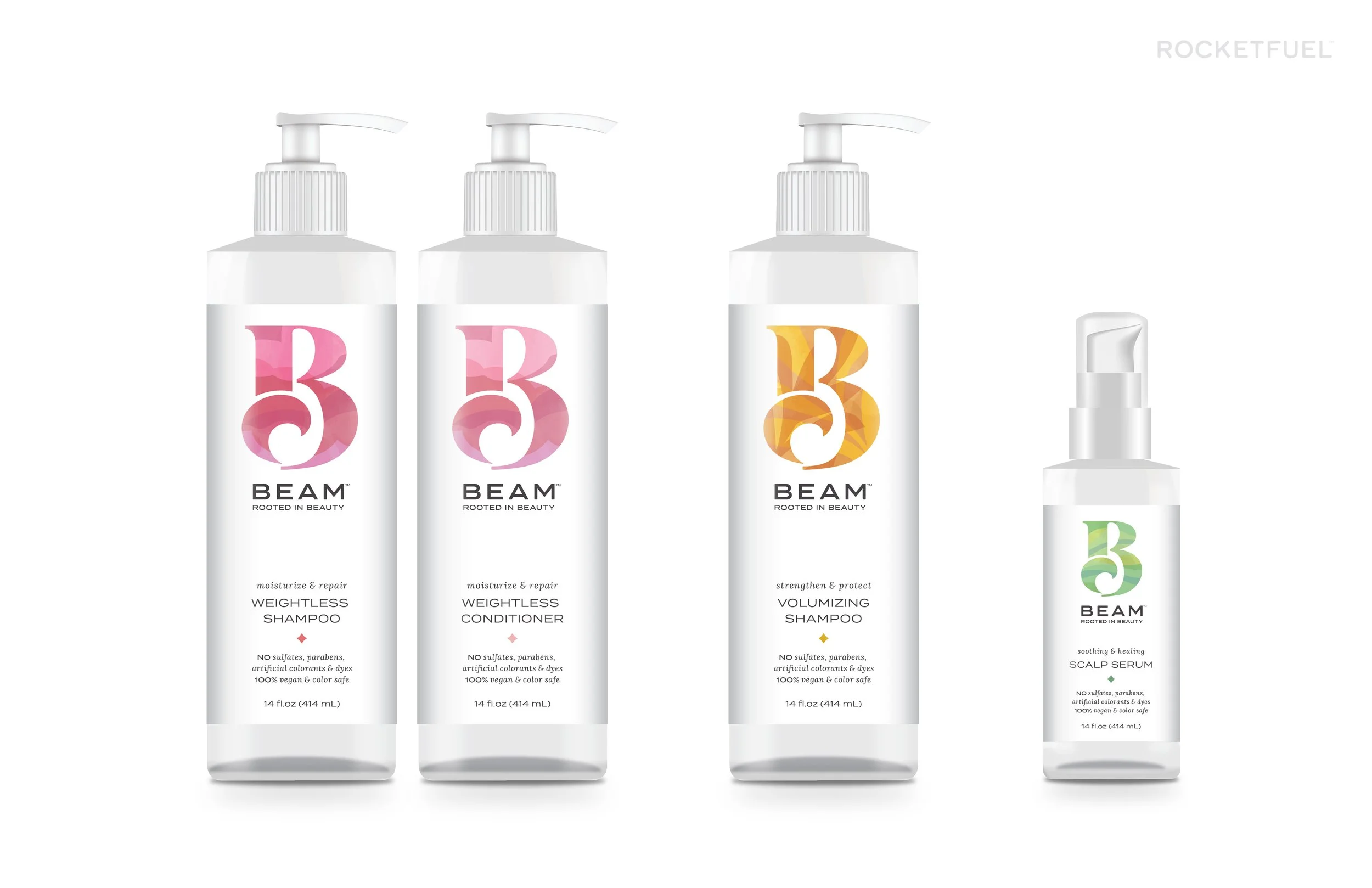
CONCEPT SHine
Key Attributes: Youthful / Contemporary / Minimal
Concept SHINE is a celebration of light. Gradients showcase the spectrum of light throughout the day and connect the products to the natural world.
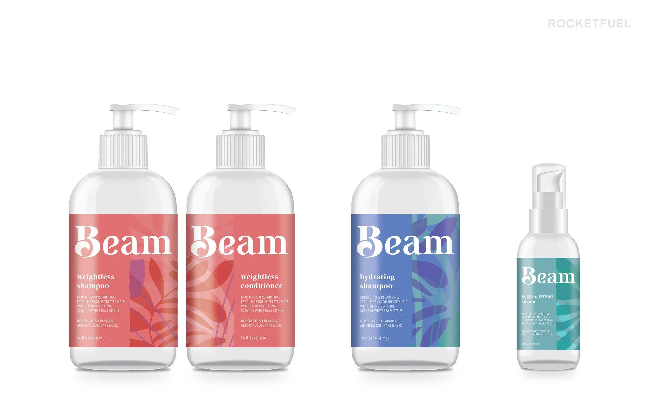
CONCEPT Bright
Key Attributes: Bold / Organic / Feminine
Concept BRIGHT is a celebration of healthy hair. The minimal layout and sophisticated typography elevate the design to salon quality while the layers of colors and organic shapes celebrate clean beauty.
concept clarity - selected concept
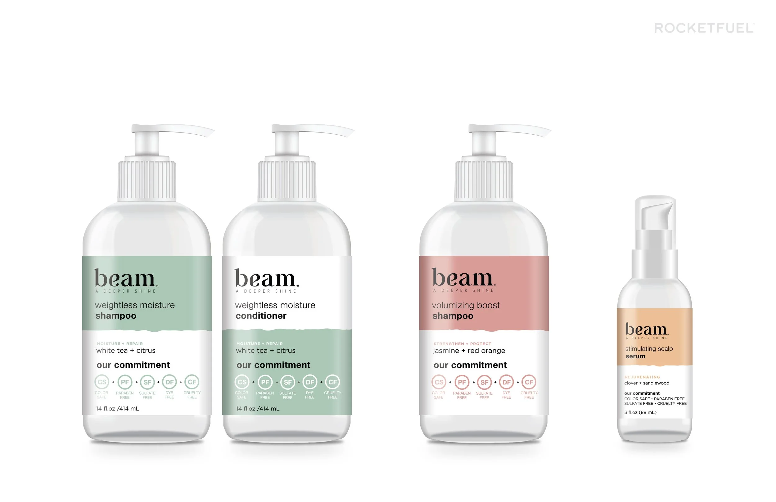
Key Attributes: Simple / Natural / Proactive
Concept CLARITY focuses the consumer on the product claims and uniqueness of the brand. The straight-forward layout and limited color pallet speak to the no-nonsense solution to clean hair care.
Refinement
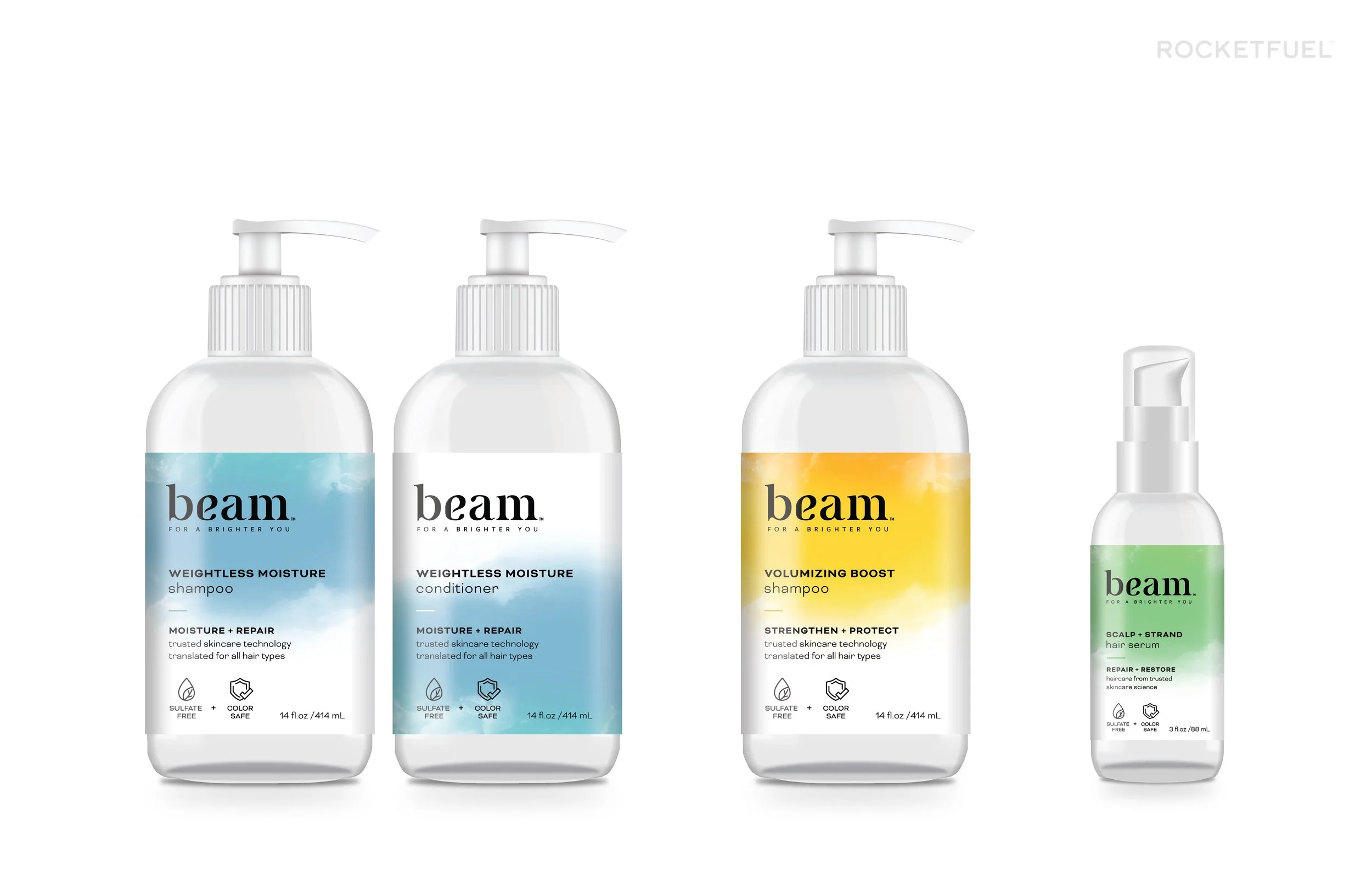
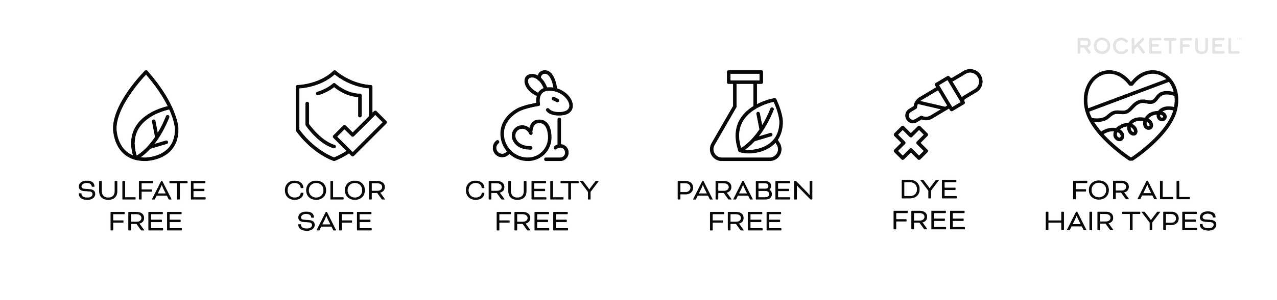
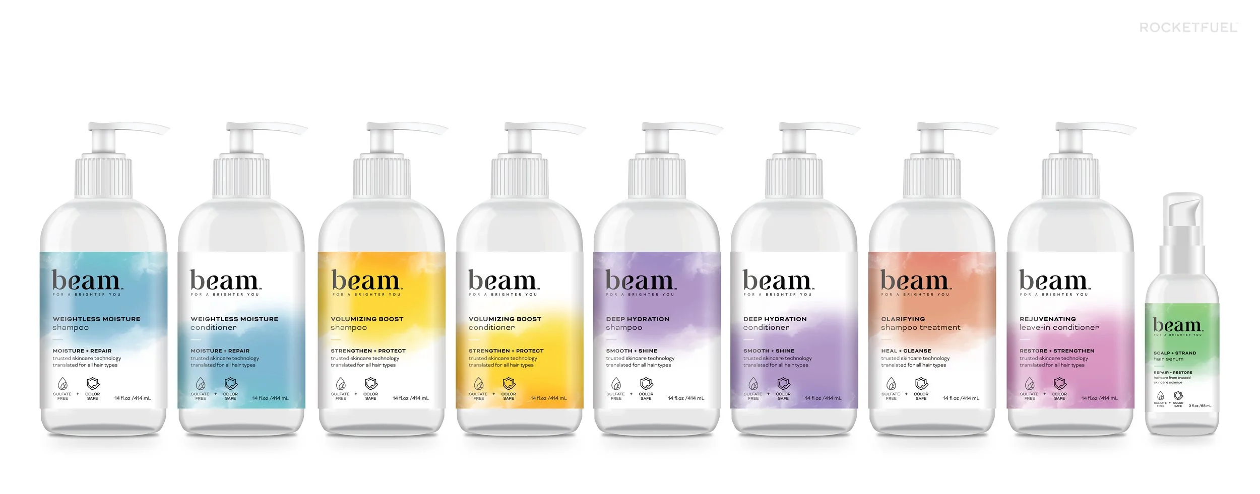
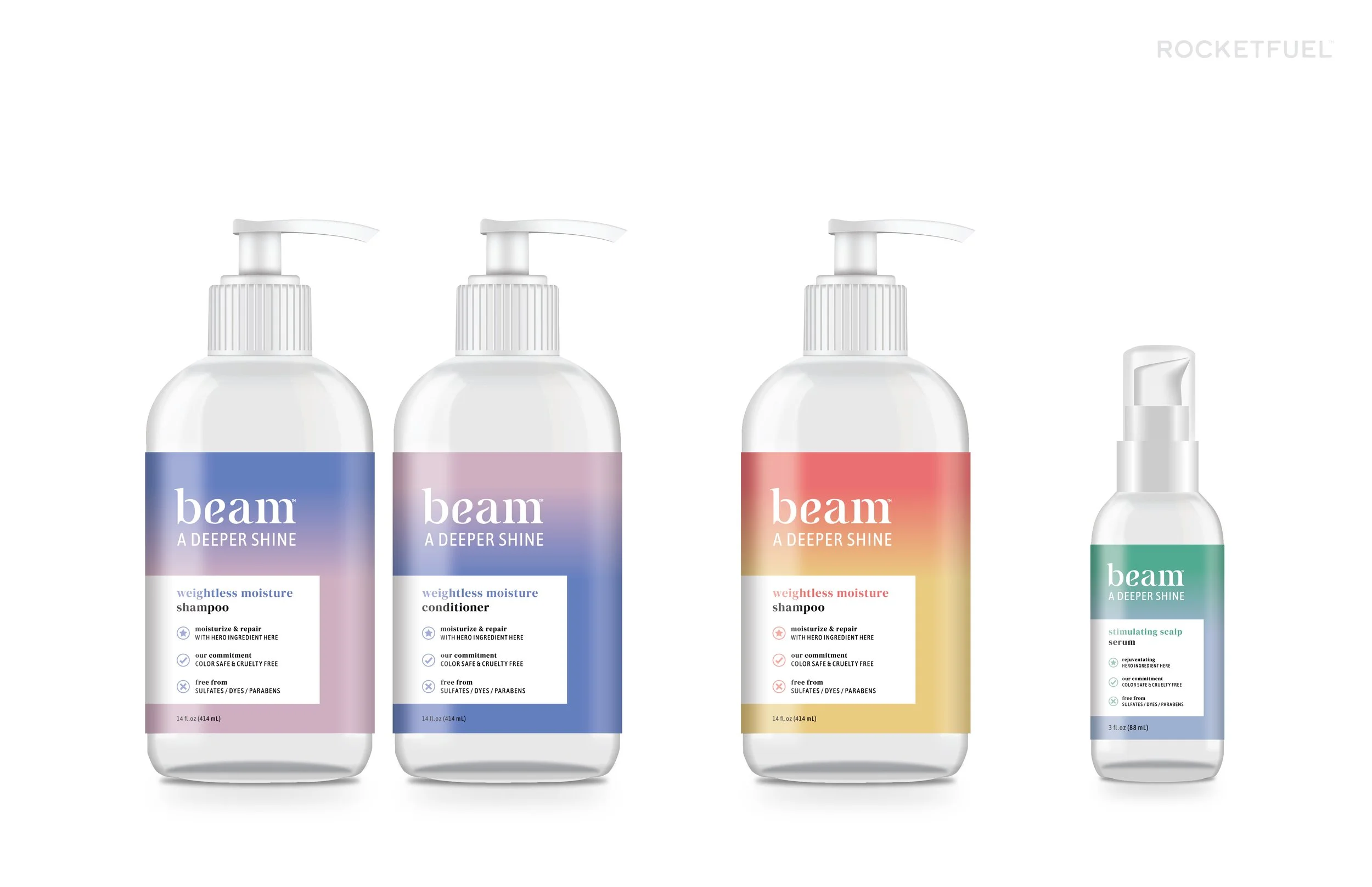
A combination of concept CLARITY (packaging) and SHINE (logo) was selected by the internal team. The team preferred the direct communication and focus on product benefits in concept CLARITY but preferred the reference to nature and the logo in concept SHINE. During the refinement phase I optimized the packaging by adding an atmospheric natural background, custom product claim icons, and more feminine typography.